
Sunday 30 November 2014
Saturday 29 November 2014
Final Concept Piece and New Orthographs

Final Concept Piece

Dome Orthograph

Lamp Orthograph

Building 1 Orthograph

Building 2 Orthograph

Building 3 Orthograph

Building 4 Orthograph
I've made a new set of orthographs that cover all of the key assets in my scene. My previous set for the 2nd OGR were a bit rushed and only covered 3 of the key assets. Hopefully these are better.
WIM - Final Concept Piece (Finished?)

I've gotten this piece to a standard I'm happy with but any and all feedback on this would be helpful. There is still time to tweak this image so if you're seeing something I'm not, don't be shy :)
Friday 28 November 2014
Film Review - Repulsion (Roman Polanski, 1965)
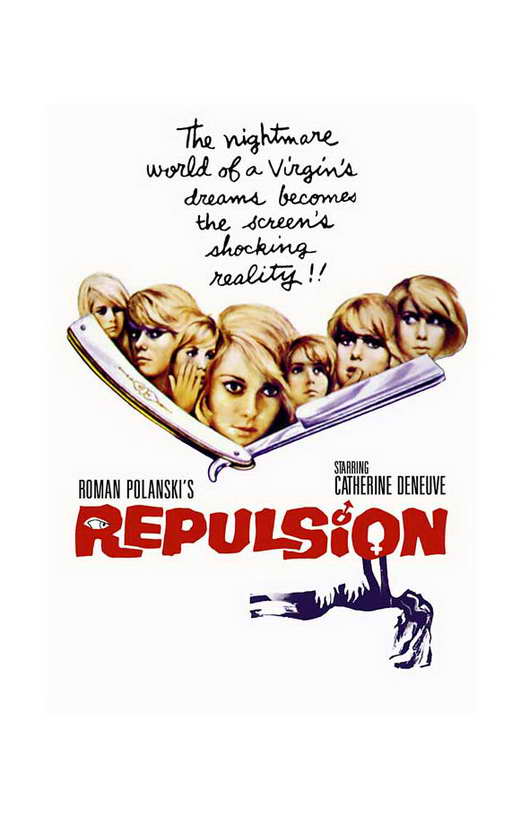
Fig 1. Repulsion Cover
Repulsion is a horror film that stands out as it stands among the few to use female killers. The majority of the story takes place in an apartment which Carol shares with her older sister. Carol is shown very early on as being a shy type who is only really comfortable around women. The older sister and her partner go away on holiday, leaving her alone in the apartment. The film then shows loops of her going to her job and returning back to the apartment. Gradually hallucinations begin to take hold of her. The isolation in the apartment is filled with visions of cracks in the walls, hands that reach out from the sides of the corridor and shocking silent nightmare sequences that sees an unknown intruder return each night to molest her. These scenes in particular are disturbing for a number of reasons, they are silent apart from the escalated noise of a ticking clock and the lack of sound forces the viewer to watch to make sense of what is happening.
Peter Bradshaw from www.theguardian.com had this to say in his review ''There can't be many other films which so plausibly show an entire, warped world created from a single point of view.'' (Bradshaw, 2013). The fact that the film uses only the distorted view of Carol throughout the film only makes it stronger in terms of its themes. Being a film that focuses on a characters quickly degrading mental health, it seems only right that the viewer is only allowed scenes from her viewpoint. Repulsion uses cracks in the apartment walls and hallucinations to bring the message across that all is not well with the character they are seeing. The cracks become ever more prominent as the film progresses and this is clearly a sign for the viewer that things are getting worse.

Fig 2. Wall Crack.
Bosley Crowther talks about the sound-scape of the film in his review ''And with sound, too, Mr. Polanski weaves a fabric of tremendous effects.'' (Crowther, 1965). The sound in the film or lack thereof is definitely a key that makes the bizarre scenes and images in the film all the more engaging to the audience. The eerie clock ticking that takes over the otherwise soundless nightmare scenes, the roaring ripping sound that accompany the tearing walls and the quiet apartment scenes that flow into busy street scenes. The last in particular shows how perhaps the outside world is portrayed to show her dwindling sense of sanity and the inside is portrayed as a projection of her ever deepening madness.
In their review of the film, Kim Newman states ''Hitchcock ends the film with a lecture on why Norman is mad, but Polanski just closes in on a family photograph to drop hints about the roots of the blonde angel’s insanity.'' (Newman, s.d.). While Polanski can be easily compared to Hitchcock for their similar uses of the mental state of characters in their films, this quote brings up their distinct differences. While Hitchcock may like to be clear with audiences about what they are seeing, Polanski seems to use subtle tricks and techniques to more organically steer the viewer into understanding scenes. Polanski uses numerous metaphors for Carol's mental well-being, the cracks and the slowly rotting rabbit to name only two(See Fig 3).

Fig 3. Rotting Rabbit
The clever subtlety in this film and the excellent uses of sound are without a doubt two defining factors that have seen this film rise above others in the horror genre.
Illustration List
Polanski, R (1965) Figure 1. Repulsion Cover. http://images.moviepostershop.com/repulsion-movie-poster-1965-1020434006.jpg (Accessed on 27/11/14)
Polanski, R (1965) Figure 2. Wall Crack. https://blogger.googleusercontent.com/img/b/R29vZ2xl/AVvXsEiIIdlxAHqle7hWxJubWTdcy_UbAPC7QxzmFtDBasf-UMtIPjZIsPfv2Sey31yEOa-dbnvTMUSur0ZGsxZPV7r8GzunMK3QbRfkgTQSK-itetel9GsaKNrSC0U9ZDP2Bnc1Bn5duRdnFzM/s1600/repulsion+3.jpg (Accessed on 28/11/14)
Polanski, R (1965) Figure 3. Rotting Rabbit. https://unholyterrors.files.wordpress.com/2012/03/repulsion18.png (Accessed on 28/11/14)
Bibliography
Bradshaw, P (2013) http://www.theguardian.com/film/2013/jan/03/repulsion-review (Accessed on 28/11/14)
Crowther, B (1965) http://www.nytimes.com/movie/review?res=EE05E7DF1739E471BC4C53DFB667838E679EDE (Accessed on 28/11/14)
Newman, K (s.d.) http://www.empireonline.com/reviews/reviewcomplete.asp?FID=134914 (Accessed on 28/11/14)
Thursday 27 November 2014

Wednesday 26 November 2014


Tuesday 25 November 2014
WIM - Concept Art (Expanding the Shot)

Managed to get a base down for the rest of the image without too many marks of edges showing through, still very much a work in progress and any feedback is welcome :)
Film Review - Black Narcissus (Michael Powell, 1947)

Fig 1. Black Narcissus Poster.
Black Narcissus is a film set in the Himalayas in a remote valley, where a group of nuns travel to spread western medicine and education to the local population. The film follows the nuns and their mental and physical ordeals which eventually sees one of them lose their mind. Sister Ruth is overcome by the psychological strains that the environment of Mopu Palace forces upon her, she then attempts to throw one of the other nuns from the cliff top upon which the palace stands. This attempt merely concludes with her own tragic death. She is shown throughout the film as being an outcast and a weaker member of the order, prone to emotional outbursts and not very social.
This quote from Thomas Pryor highlights the setting of the film very well ''The awesome grandeur of the setting, a fantastic old palace perched on a mountainside 8,000 feet above the floor of India but still dwarfed by the snow-capped peaks of Kanchenjunga, is stunningly reflected in Technicolor.'' (Pryor,1947). Black Narcissus' setting is such a large focal point throughout, that it needed to have strong design aspects to properly highlight things like altitude and grandeur. The film does indeed highlight these features well and it has a very strong aesthetic. The bell ringing scenes show particularly breath-taking shots of the valley and the village below and much of that would of been matte paintings.
Joseph Lanthier had this to say about the design aspects of the film ''Vast cubicles of matte paintings seem both deep enough to get lost in and flat enough to echo screams of fright and pleasure for years; prosthetic bamboo trunks smart even more intensely than real ones when tripped over.'' (Lanthier, 2012). The matte paintings were flawlessly completed, it would be very hard indeed to tell where the scene stops and the painting begins sometimes. These paintings helped bring the altitude to the scenes and also helped to scale the palace against the mountainside. The scenes that include the bell ringing have a particular strength and that could be mostly due to matte painting shown from a top down camera shot (See Fig 2 & 3).

Fig 2. Bare Bell Scene
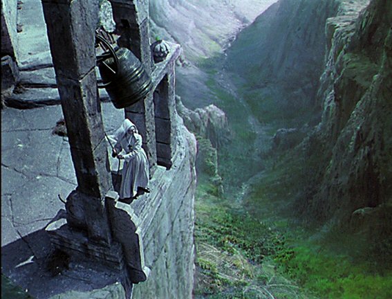
Fig 3. Finished Bell Scene
''In the golden light of dawn Ruth stalks Clodagh to the chapel before erupting out of the Palace doors like an apparition from hell and attempting to push Clodagh over the precipice as she rings the morning bell.'' (Petrie, s.d.). This quote from a review by Duncan Petrie talks about the build up and climax of the film. The slow but steady change in sister Ruth through the film is shown through colour, it is subtle at first but eventually turns to oranges, reds and then in the climax, a dark black that makes her look demonic. This subtle use of colour is extremely effective and is a big talking point around the film. This films use of matte paintings and colour really help to boost the strength of the scenes.
Illustration List
Powell, M (1947) Figure 1. Black Narcissus Poster. http://assets.flicks.co.nz/images/movies/poster/70/70afbf2259b4449d8ae1429e054df1b1_500x735.jpg (Accessed on 11/11/14)
Powell, M (1947) Figure 2. Bare Bell Scene. https://sgtr.files.wordpress.com/2012/02/black-narcissus1_thumb.jpg?w=594&h=432 (Accessed on 25/11/14)
Powell, M (1947) Figure 3. Finished Bell Scene. http://www.davidmullenasc.com/blacknarcissus9.jpg (Accessed on 25/11/14)
Bibliography
Pryor, T (1947) http://www.nytimes.com/movie/review?res=EE05E7DF173CE261BC4C52DFBE66838C659EDE (Accessed on 24/11/14)
Lanthier, J (2012) http://www.slantmagazine.com/film/review/black-narcissus (Accessed on 24/11/14)
Petrie, D (s.d.) http://www.filmreference.com/Films-Bh-Bo/Black-Narcissus.html (Accessed on 25/11/14)
Monday 24 November 2014
WIM - More Final Concept work
%2B1.jpg)


After Phil's feedback from the OGR and talking to Jordan it has become clear that for a better scene, I need to bring the image out further to show more of the city. The bottom image is a quick template of what my final image should look like. I am a bit worried about completing the image to a good standard and not taking too long on it, but with Jordan's advice I should be fine.

Sunday 23 November 2014
Final Zoetrope Animation

Friday 21 November 2014
Zoetrope Ideas


Thursday 20 November 2014


Wednesday 19 November 2014


WIM - Colour Comparisons and Final Concept Art


While this is my final concept piece, I may come back and edit some things later.
WIM - Work on Final Concept


Going to work on the colour next with a set of colour comparisons. Then I will refine it into my final image. Any feedback would be helpful, in case I have missed anything or something could be improved.
Tuesday 18 November 2014
Looking at perspective (Could use some feedback!)


Trying to work out a good angle to show my city with the best sense of scale. Once I've figured out the right shot, I will work over the top. I'm planning to then add in buildings and see which ones work together using simple forms of the buildings. Once I've done that I will refine that image to create my final piece.
Subscribe to:
Posts (Atom)